
Branding · Professional services
Belegantt: brand identity for a systems-driven B2B technology agency
Belegantt helps businesses scale through better systems and digital tools. They needed a brand with the same clarity and structure they deliver. We designed the wordmark with Gantt-chart-inspired T's, a B logomark, a gamboge-and-ink palette and full guidelines, giving them a presence built to win higher-value clients beyond referrals.
- Client
- Belegantt
- Industry
- Professional services
- Market
- US
- Services
- Logo design, Brand identity, Visual identity, Brand guidelines
- Pillar
- Build

The brief
Belegantt was growing on referrals and wanted to compete for larger B2B clients. The brand had to communicate trust, clarity and structure before a single conversation.
What we designed
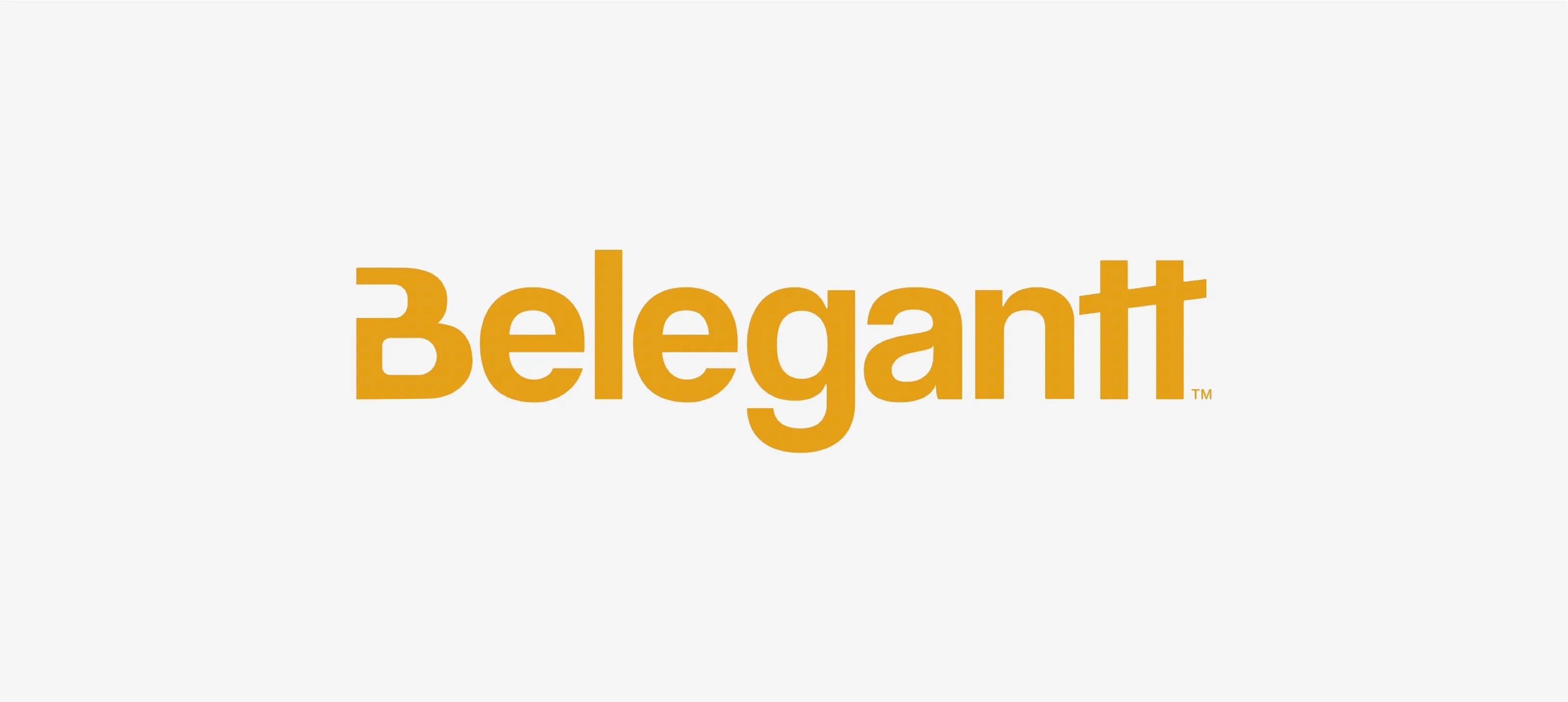
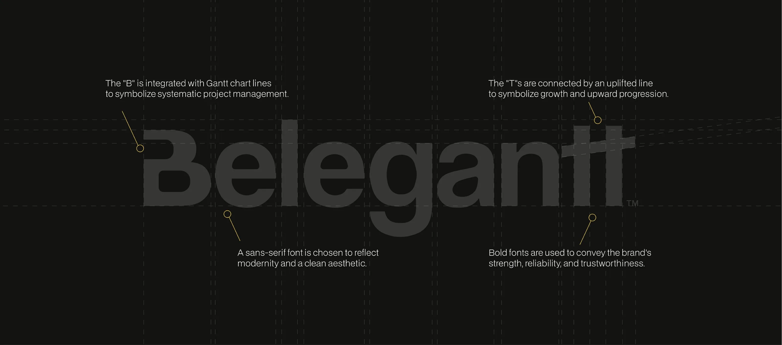
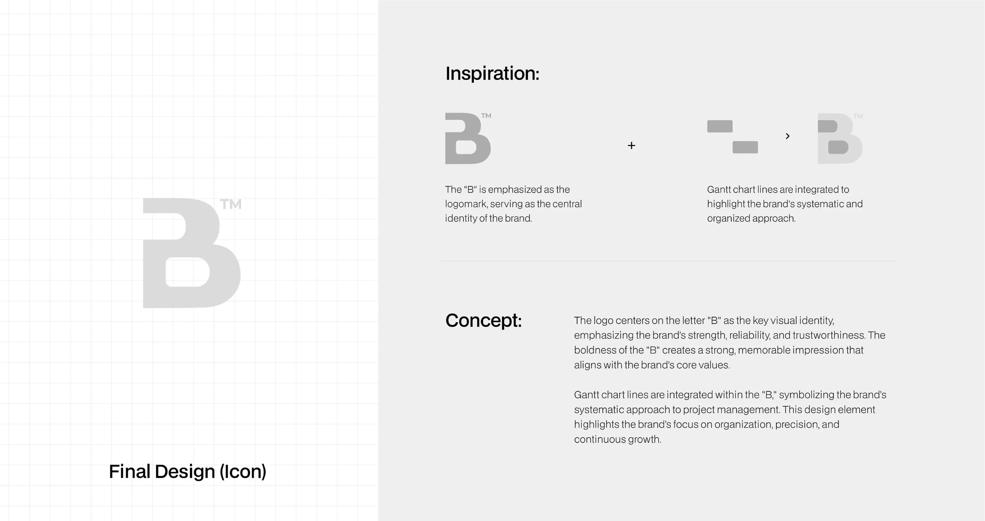
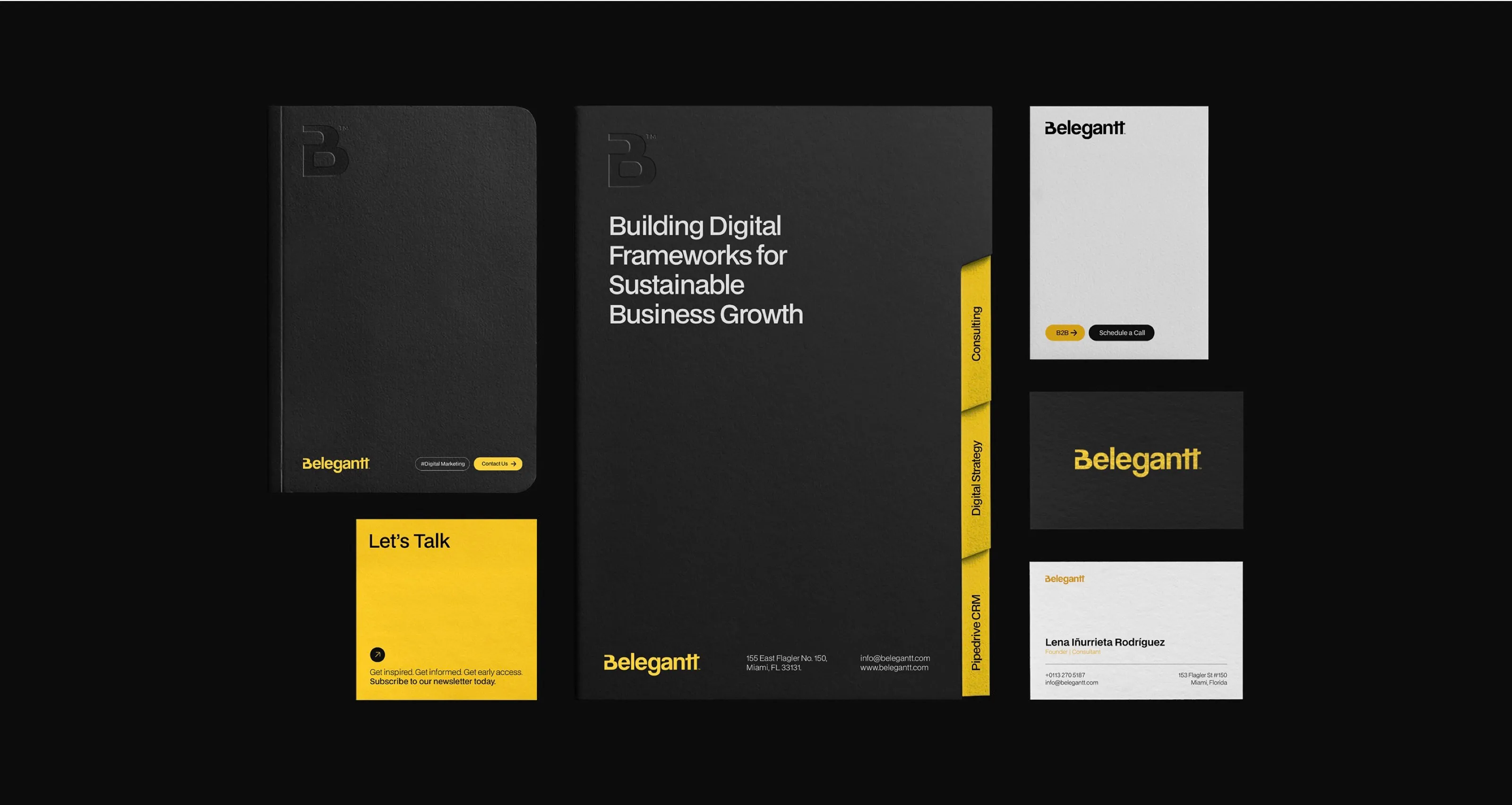
- A wordmark whose connected T’s echo Gantt chart lines, a nod to systematic project delivery, with a standalone B logomark for small sizes.
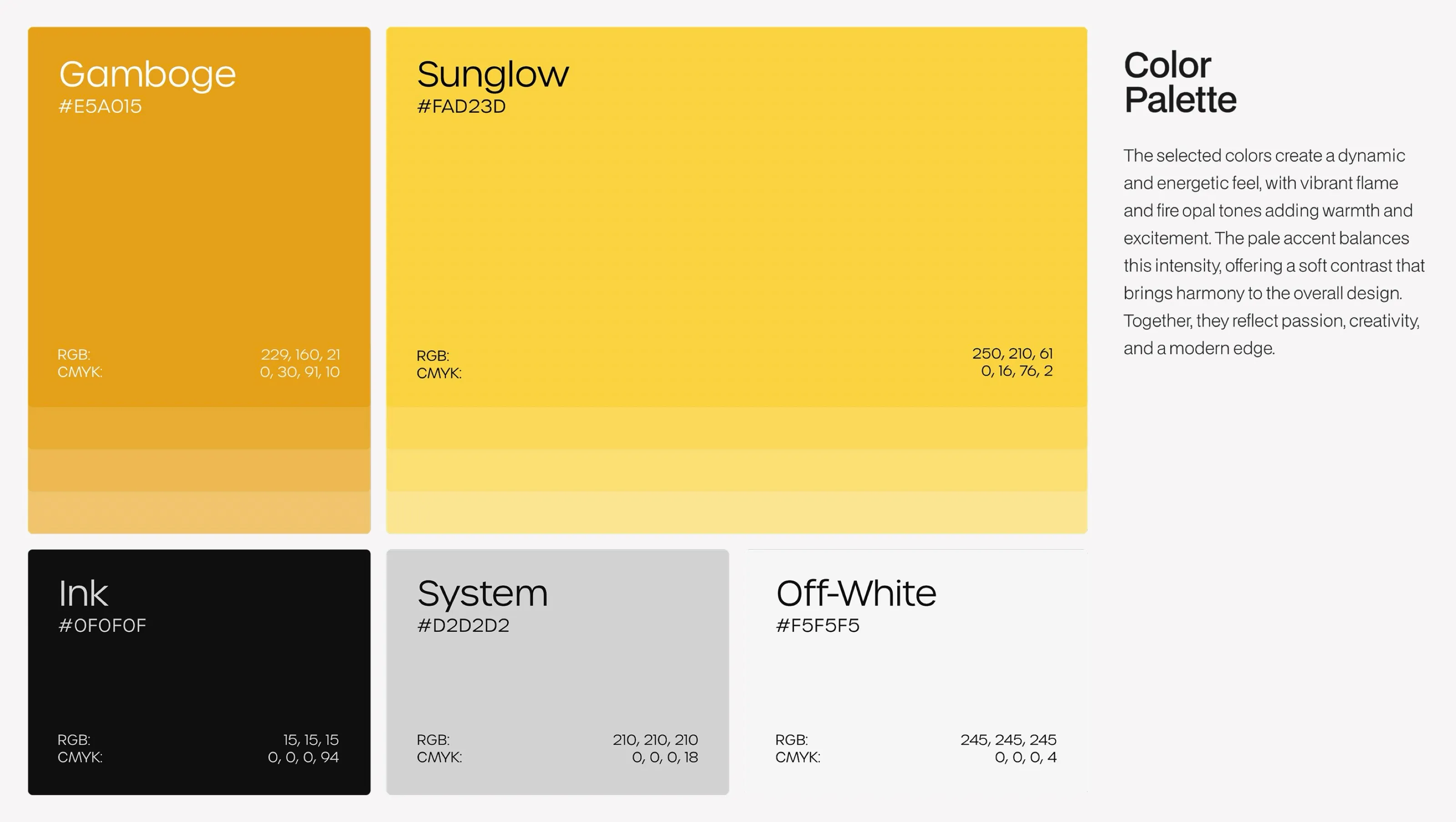
- A palette of Gamboge and Sunglow yellows against Ink black, System grey and Off-White.
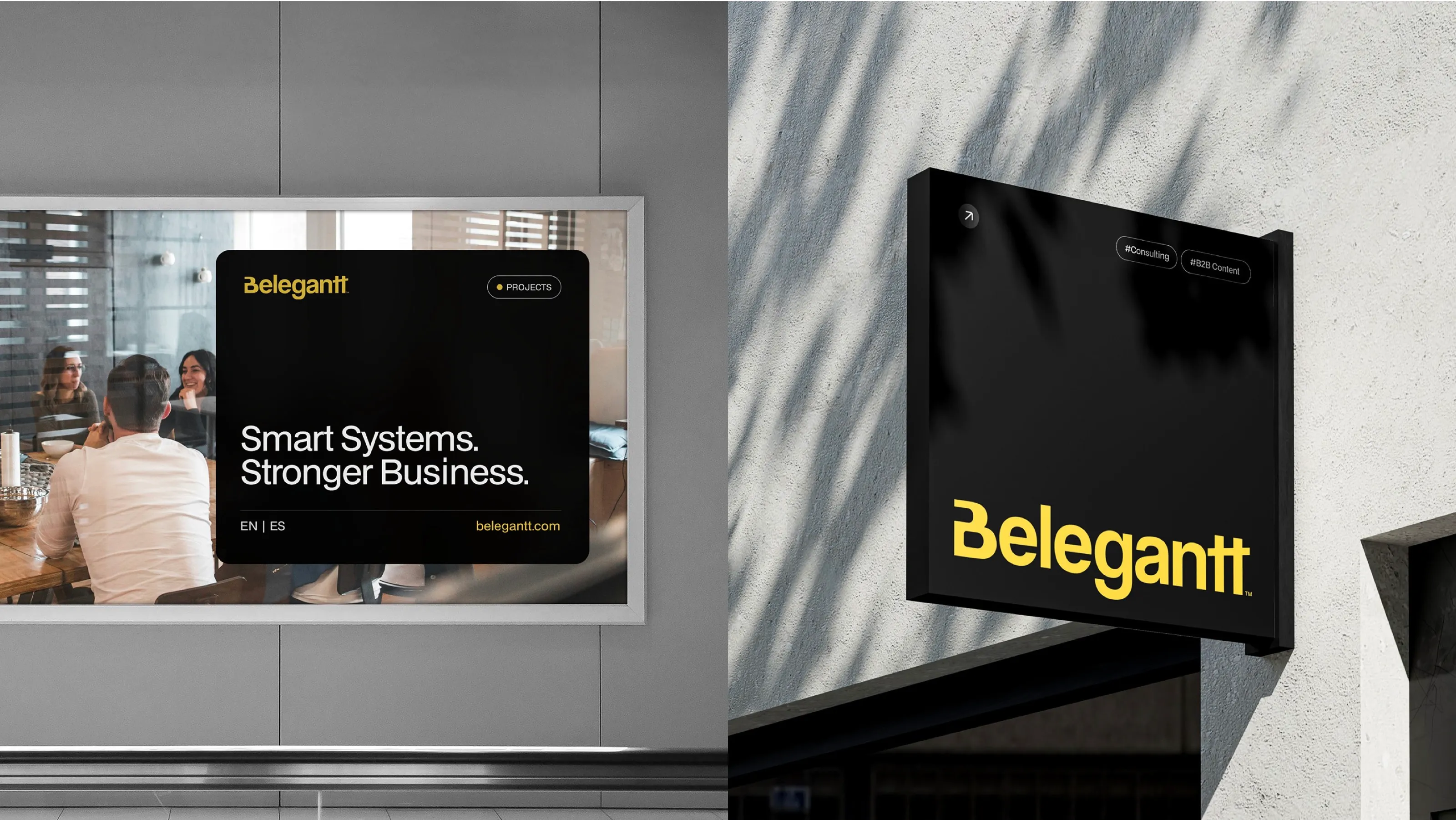
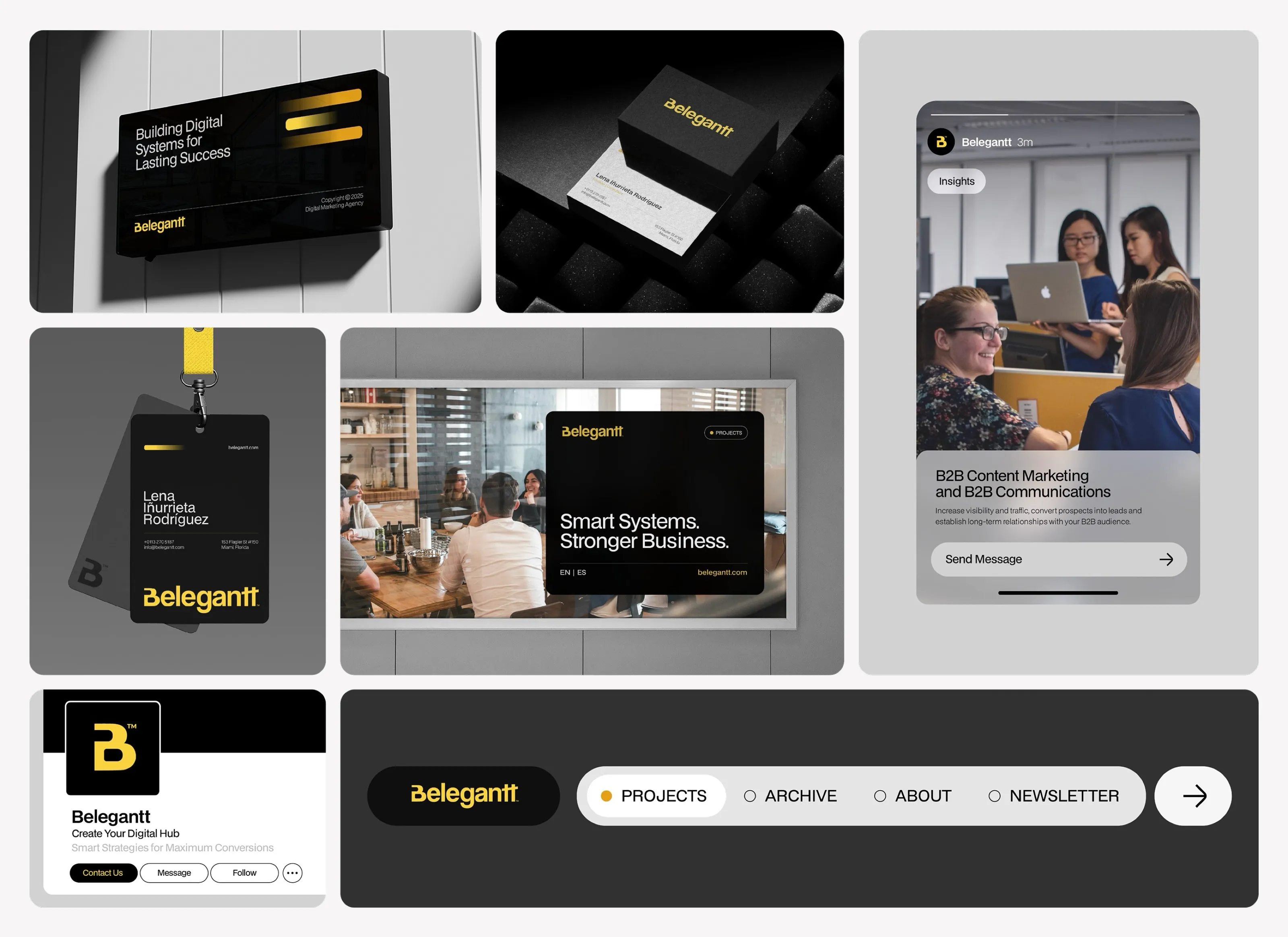
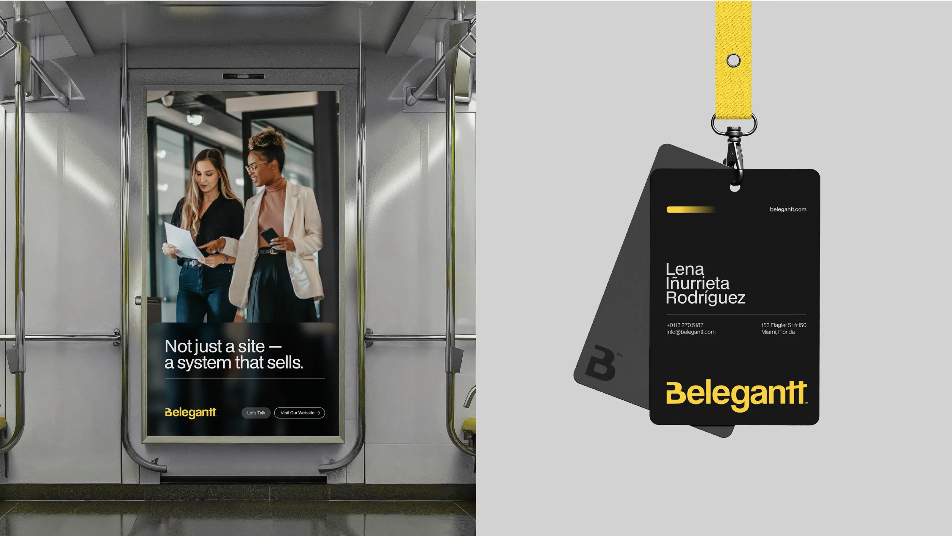
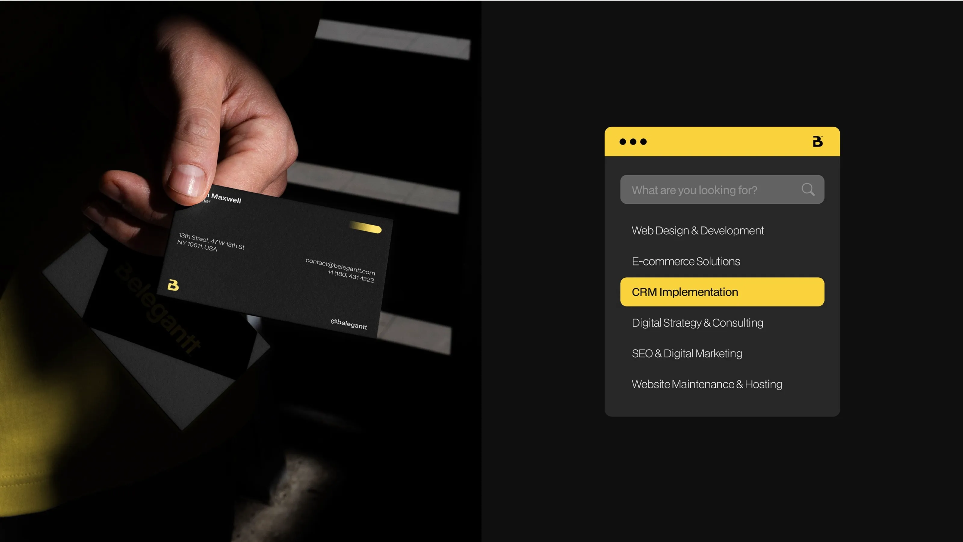
- Applications: stationery, business cards, ID badges, social templates, billboard and signage mock-ups, website components.
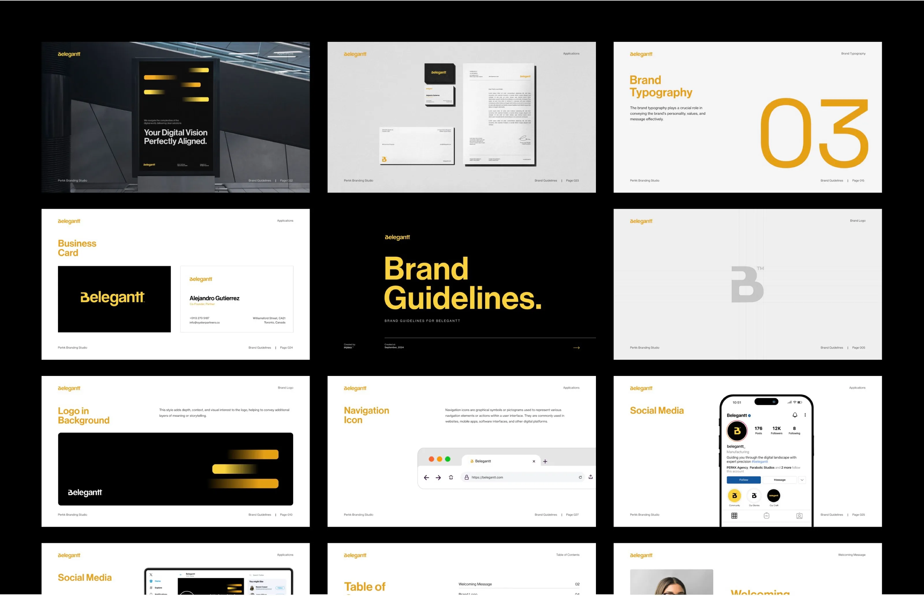
- A brand guidelines document covering logo use, typography, colour and layout.
Outcome
A modern, scalable identity that gives Belegantt a stronger market presence and a foundation to attract higher-value clients.