Branding · Food & hospitality
Loconada: playful brand identity for an empanada food brand
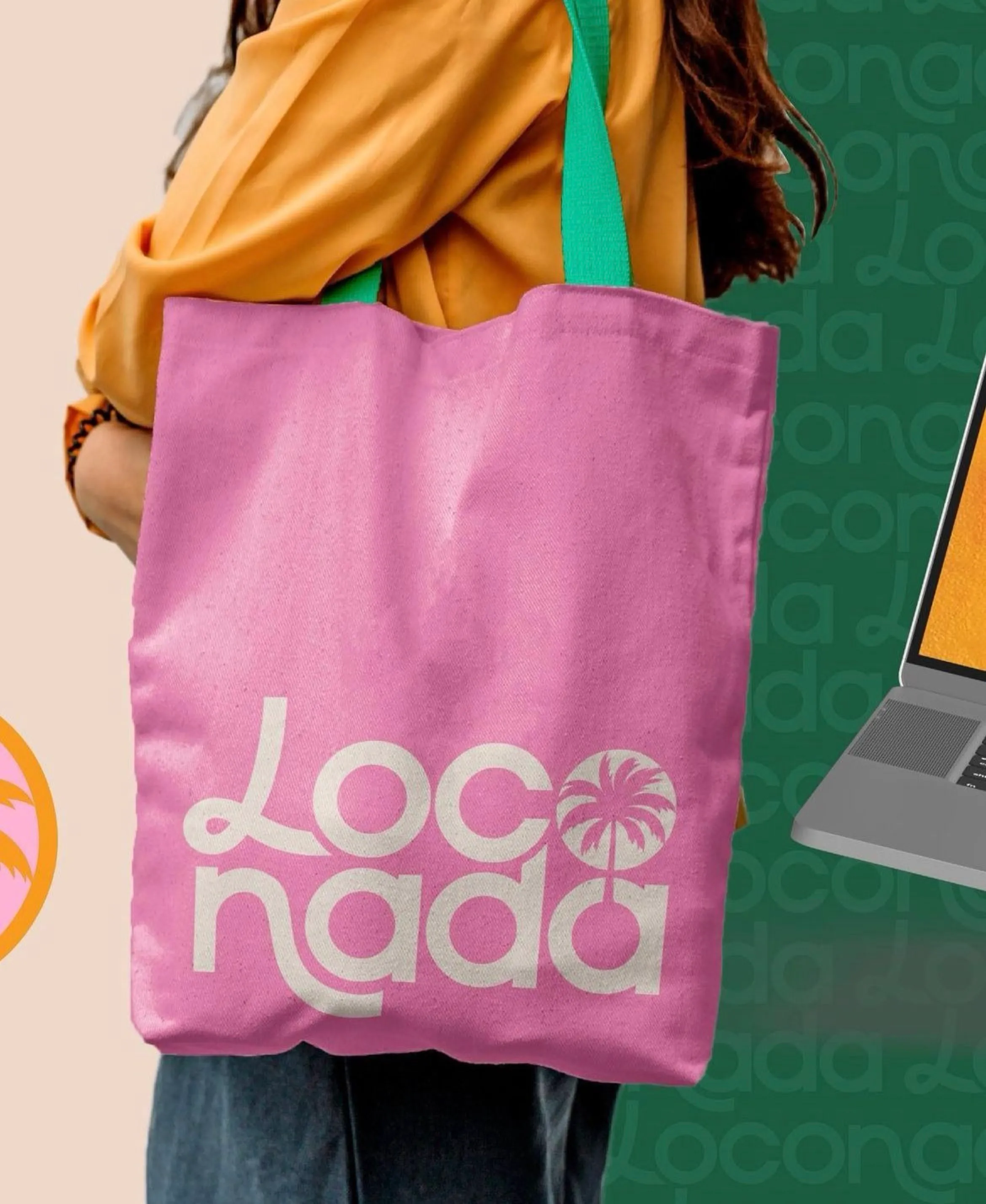
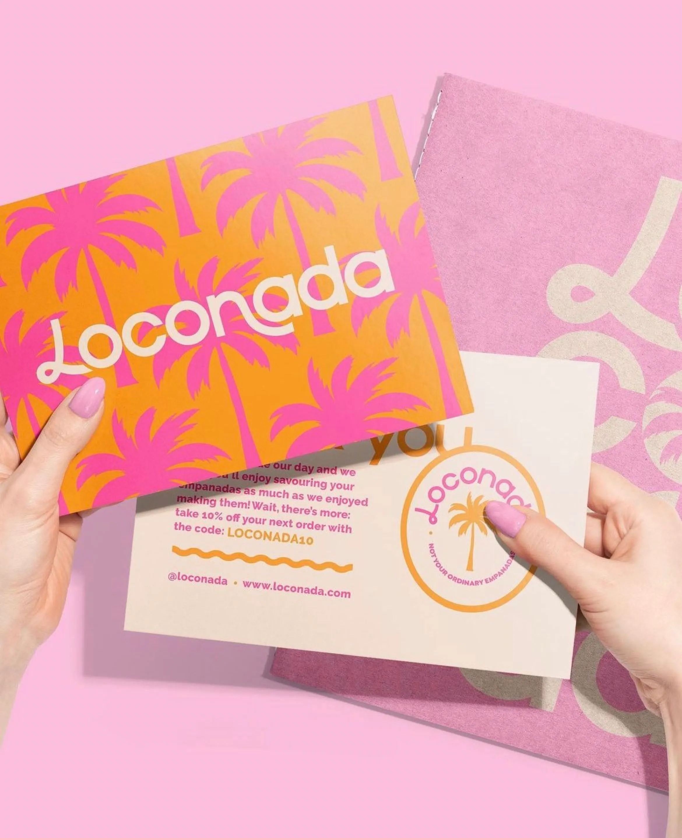
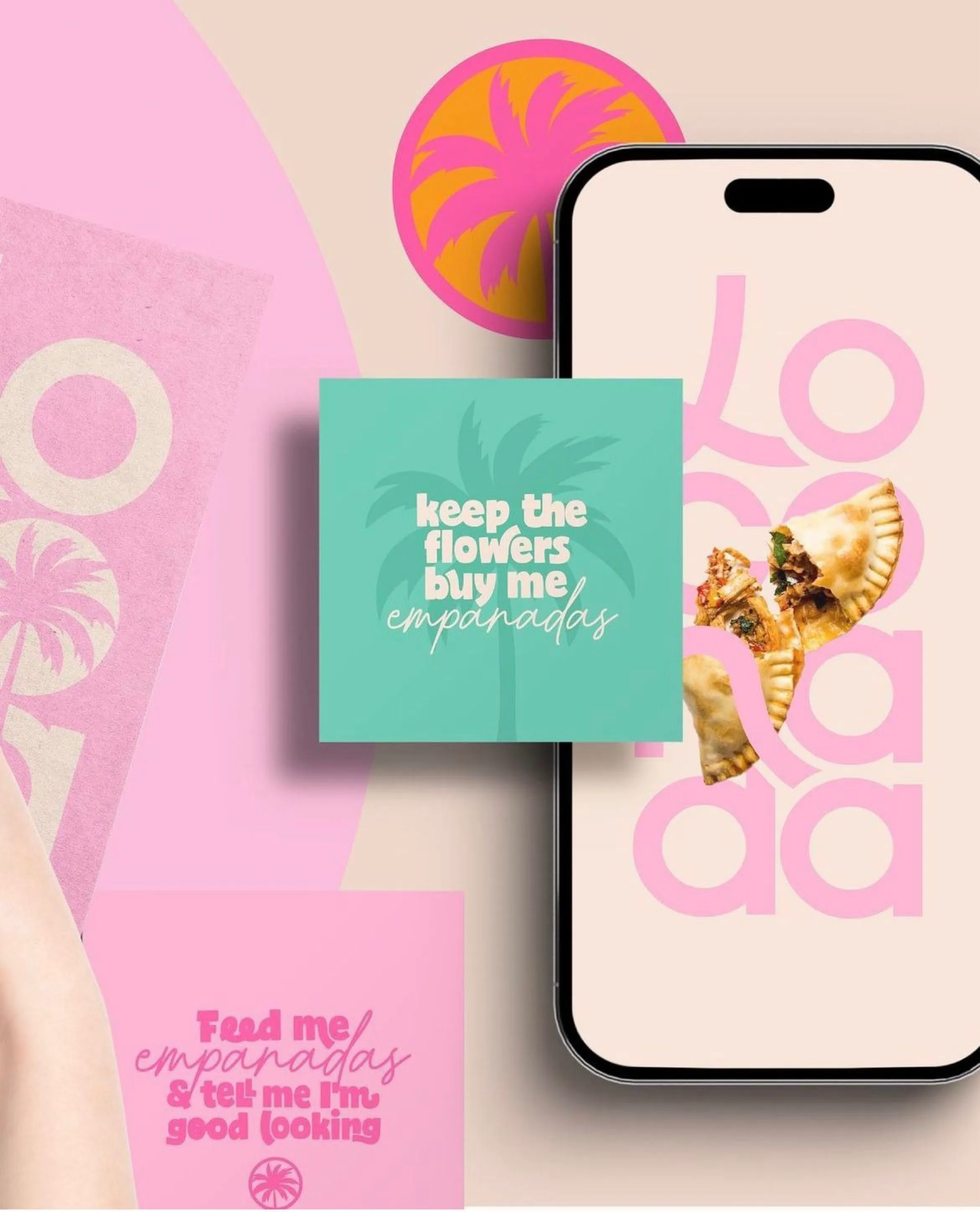
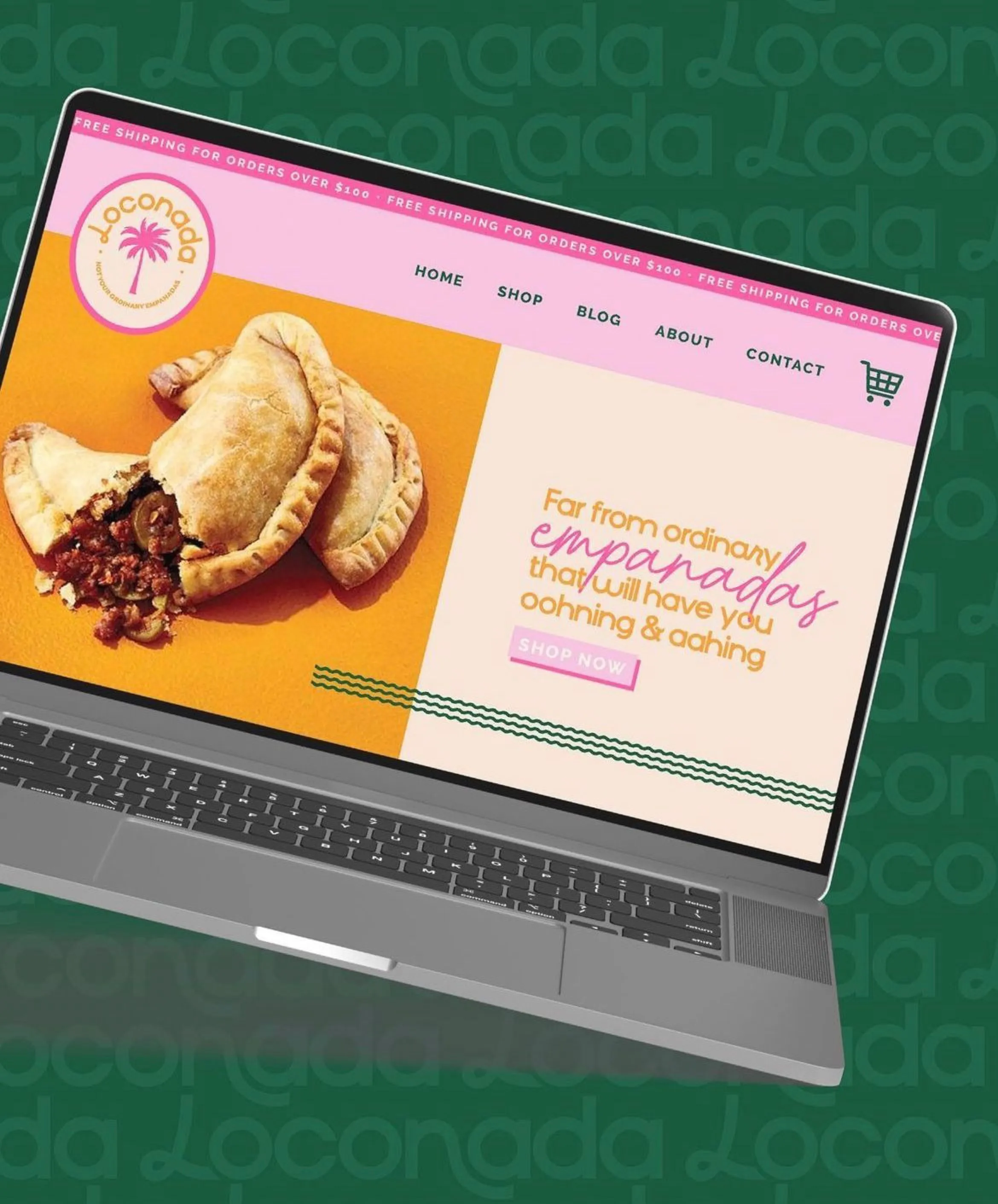
A modern, approachable identity for Loconada, an empanada brand: a custom logotype with a palm-tree mark, a hot pink, orange and green palette, playful copy lines, print collateral, social templates and a matching e-commerce homepage.
- Client
- Loconada
- Industry
- Food & hospitality
- Services
- Logo design, Brand identity, Packaging & print, Social templates, Web design
- Pillar
- Build
What we designed
- A custom logotype with a palm-tree detail and a cohesive colour system of pink, orange, teal and green.
- Tone of voice and copy lines (“keep the flowers, buy me empanadas”) used across packaging and social.
- Print collateral, tote bags, discount cards and social media templates.
- A homepage design that carries the identity into the online shop.
Outcome
A memorable, consistent brand that positions Loconada as a fun, modern food company.