Branding · Fintech, SaaS & apps
Clarium: logo and brand identity for a B2B AI cybersecurity firm
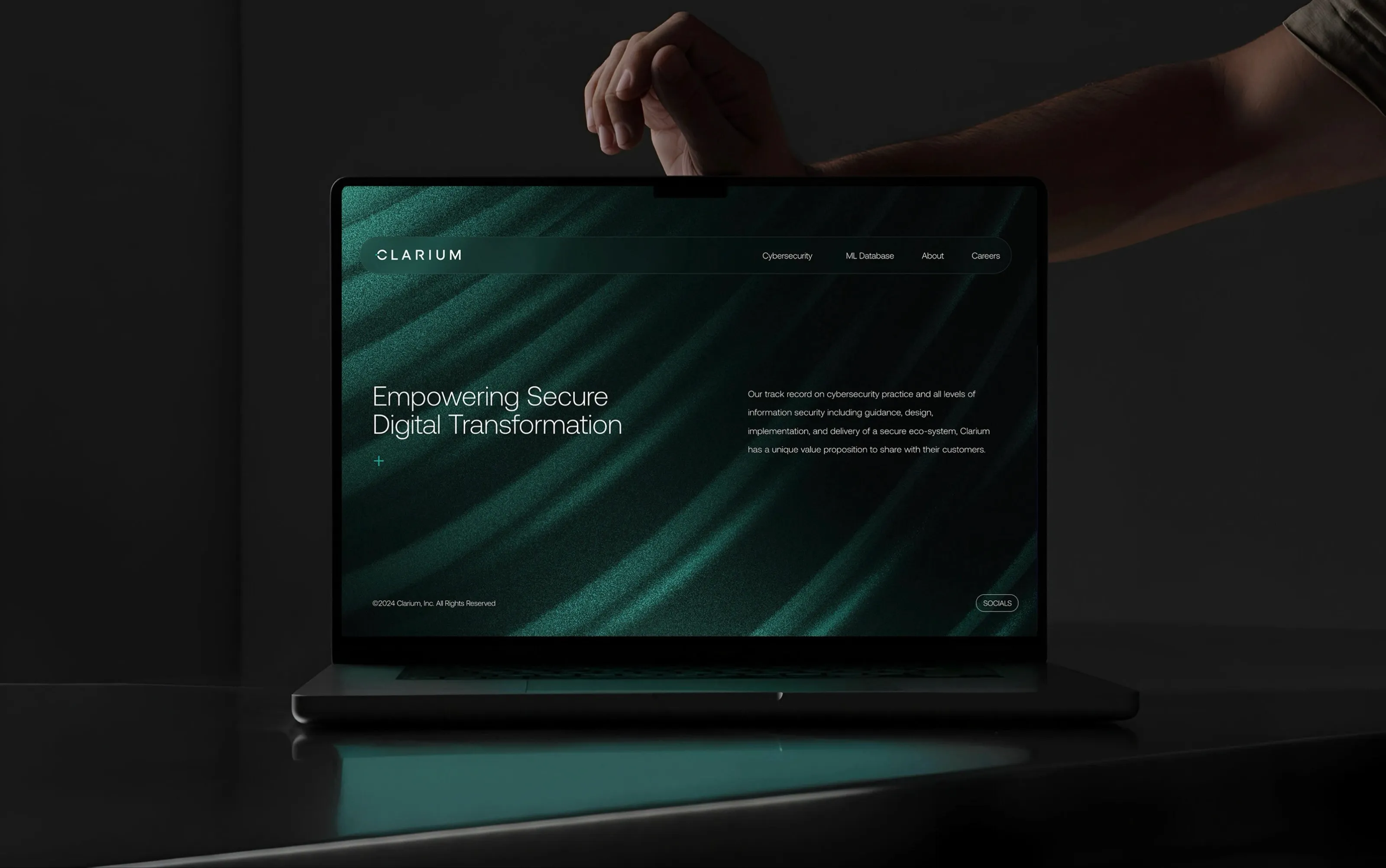
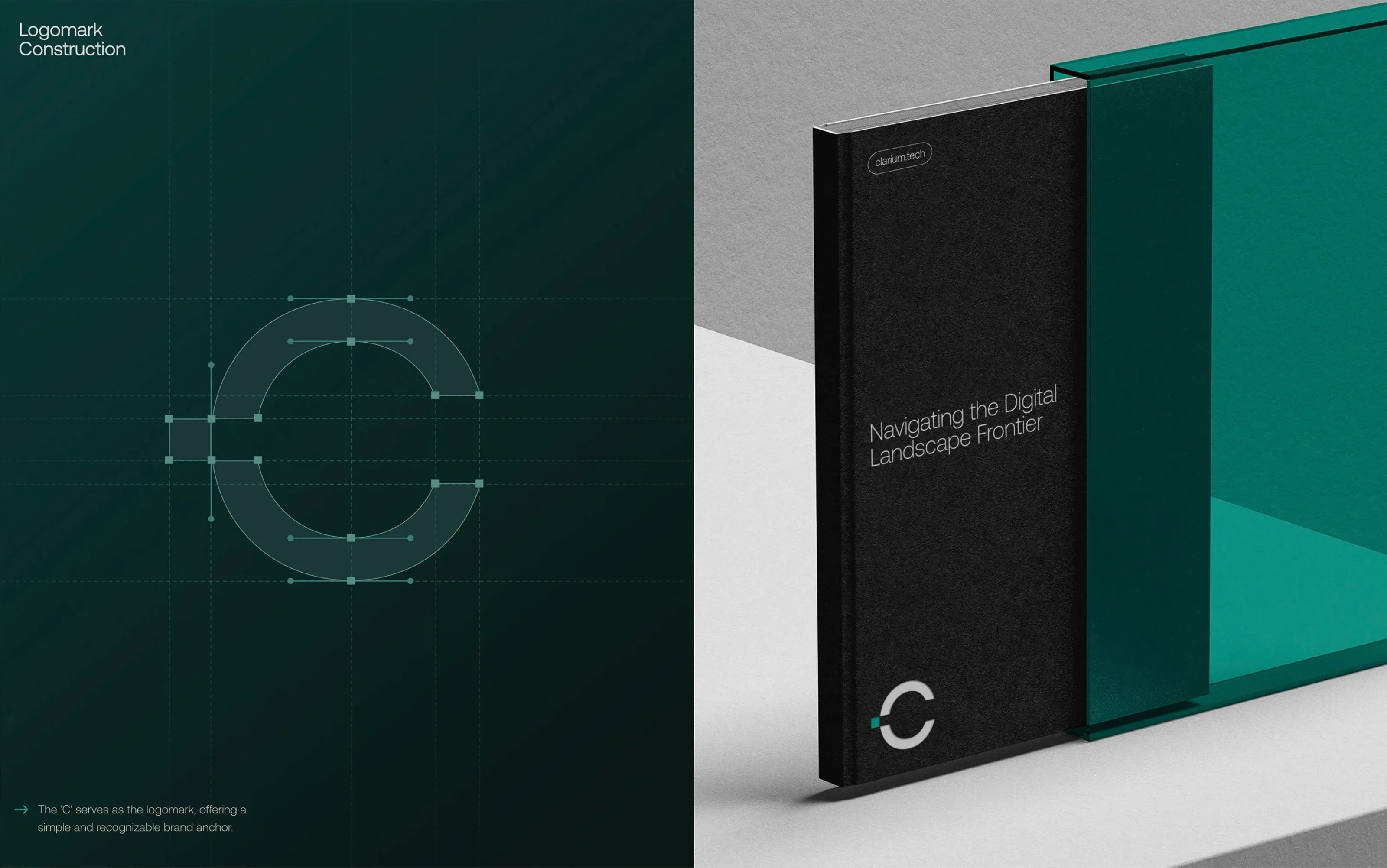
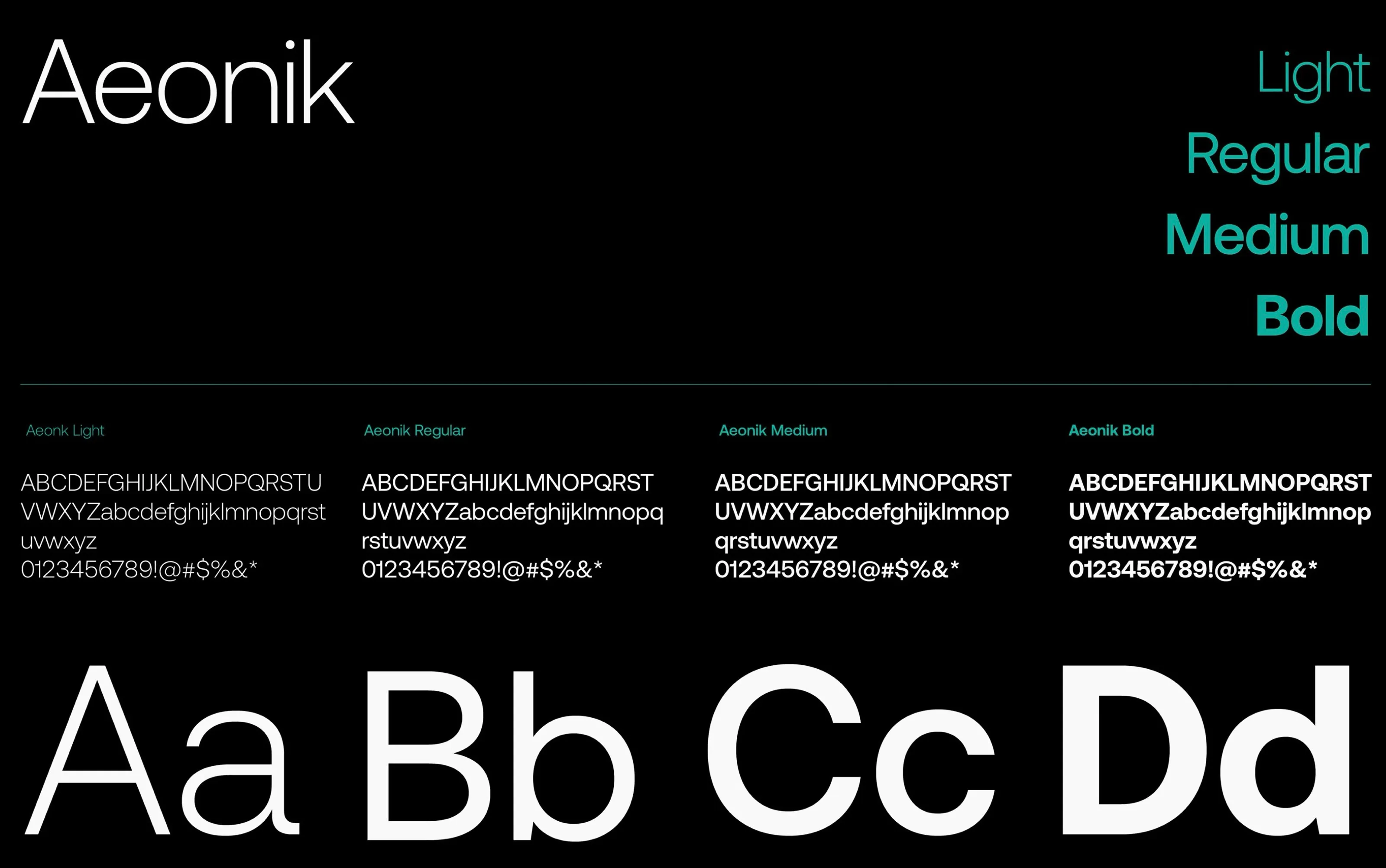
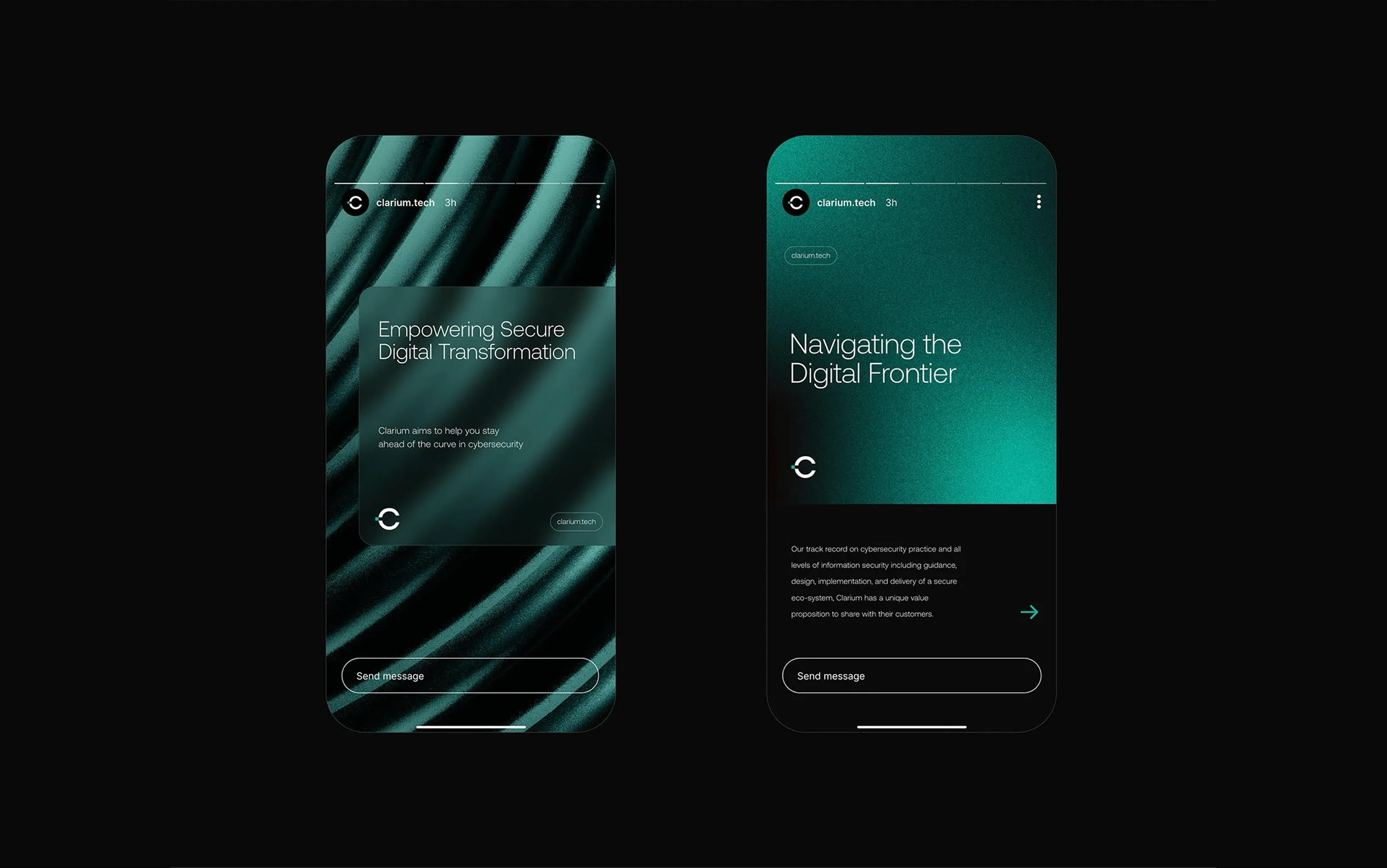
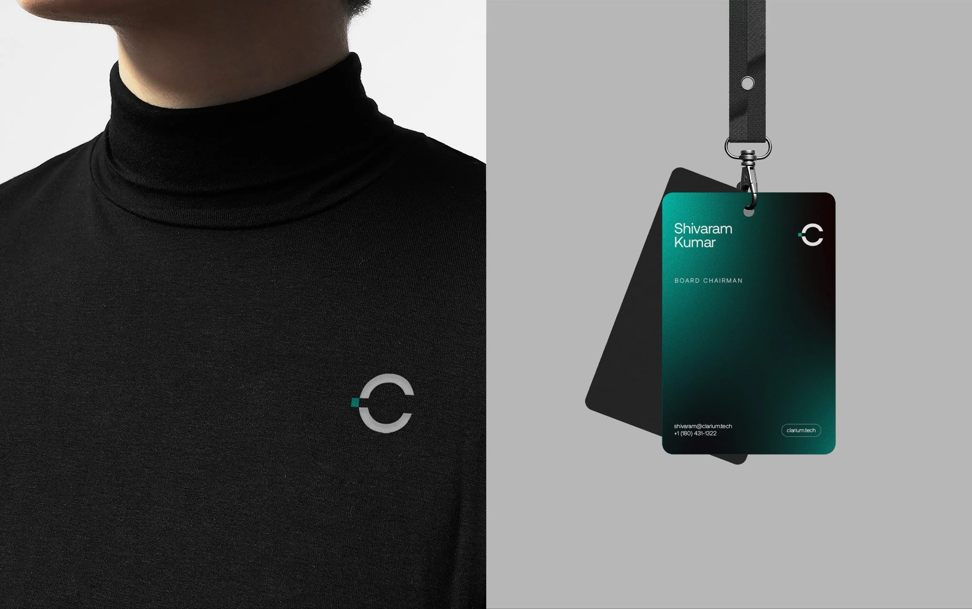
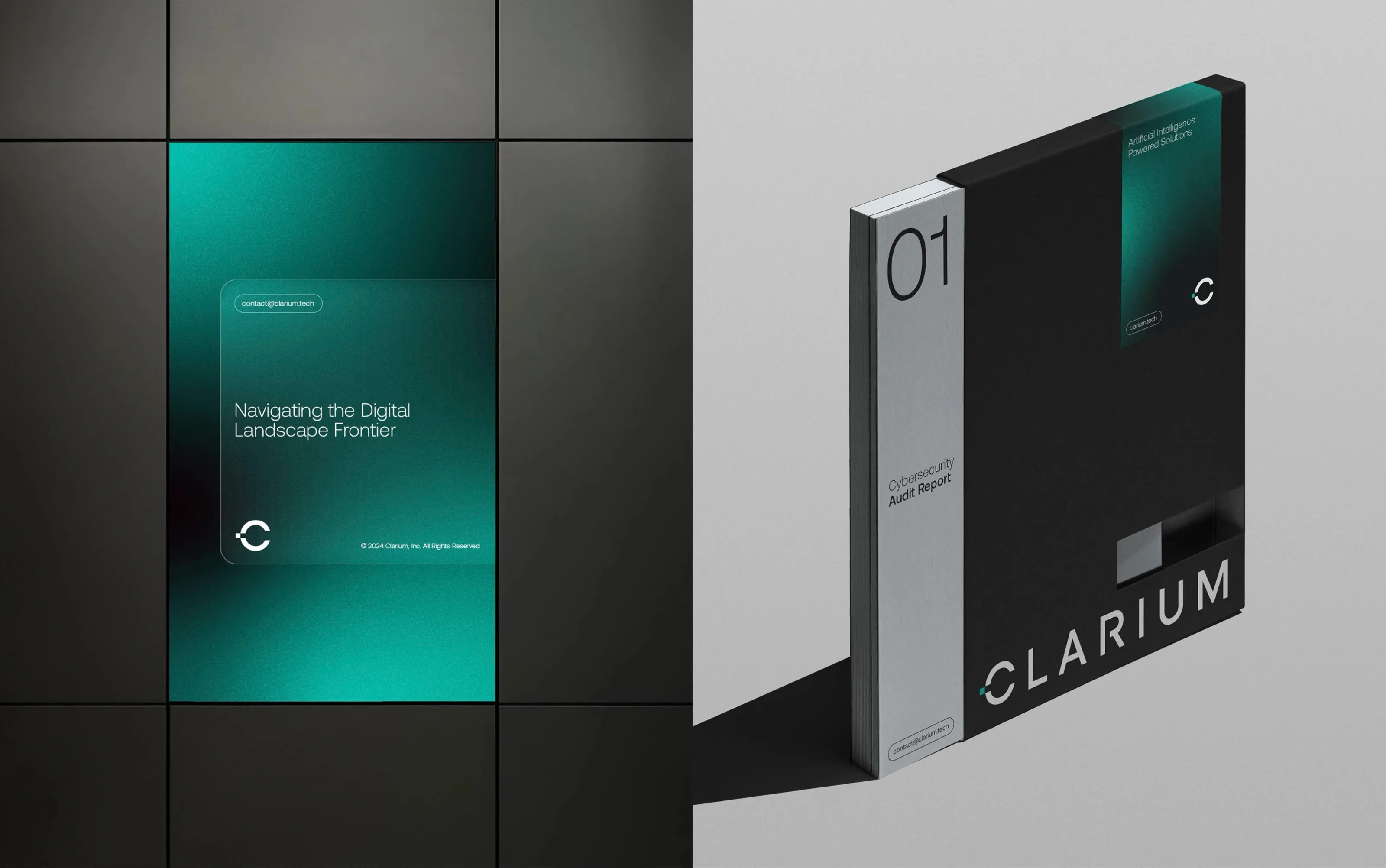
Clarium is a B2B cybersecurity consultancy for enterprises. Their visual system was scattered, which undermined confidence in sales meetings. We designed a bold, enterprise-grade identity, the C logomark, Aeonik typography, a dark teal system and a professional pitch deck. Clarium has since grown to serve 1,000+ clients.
- Client
- Clarium
- Industry
- Fintech, SaaS & apps
- Services
- Logo design, Brand identity, Visual system, Brand guidelines, Pitch deck
- Pillar
- Build
The brief
Clarium sells cybersecurity consulting to enterprises, where credibility is the product. Their existing visuals were inconsistent and made presenting to prospects harder than it should have been.
What we designed
- A logomark built from the letter C on a precise geometric construction, with a logotype to match.
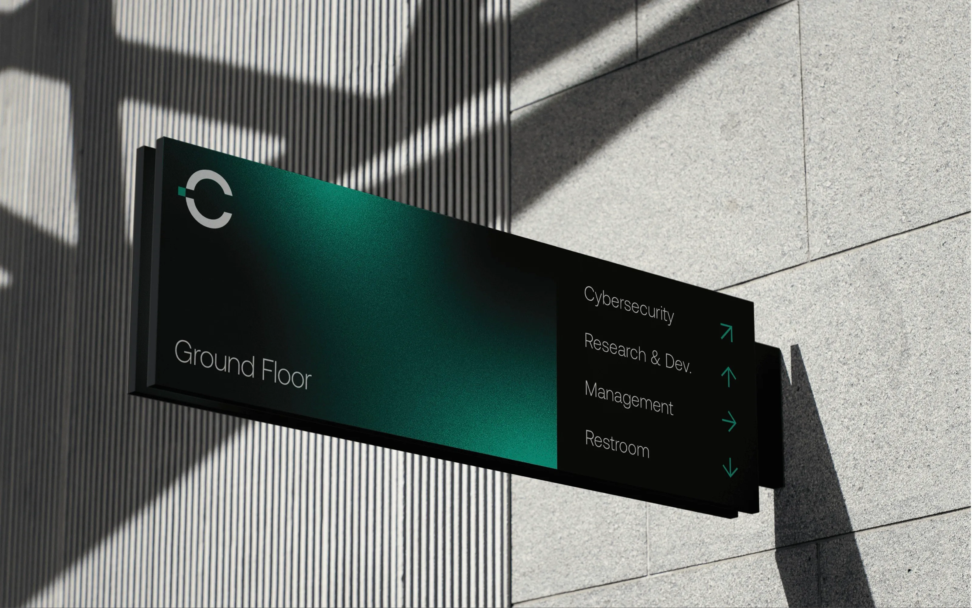
- A visual system: Aeonik typography, a dark palette with a signature teal gradient, and a textured motif used across web, print and signage.
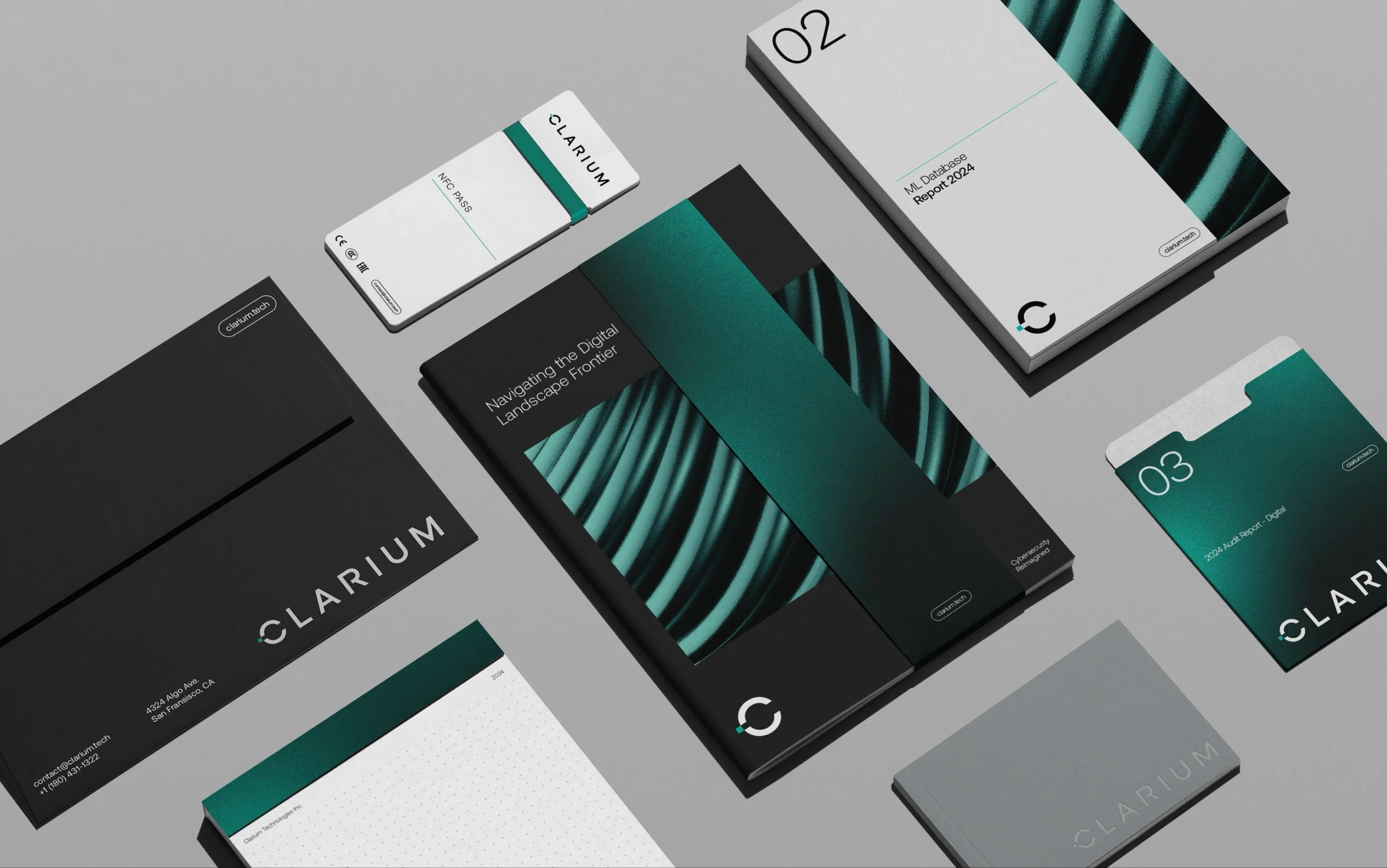
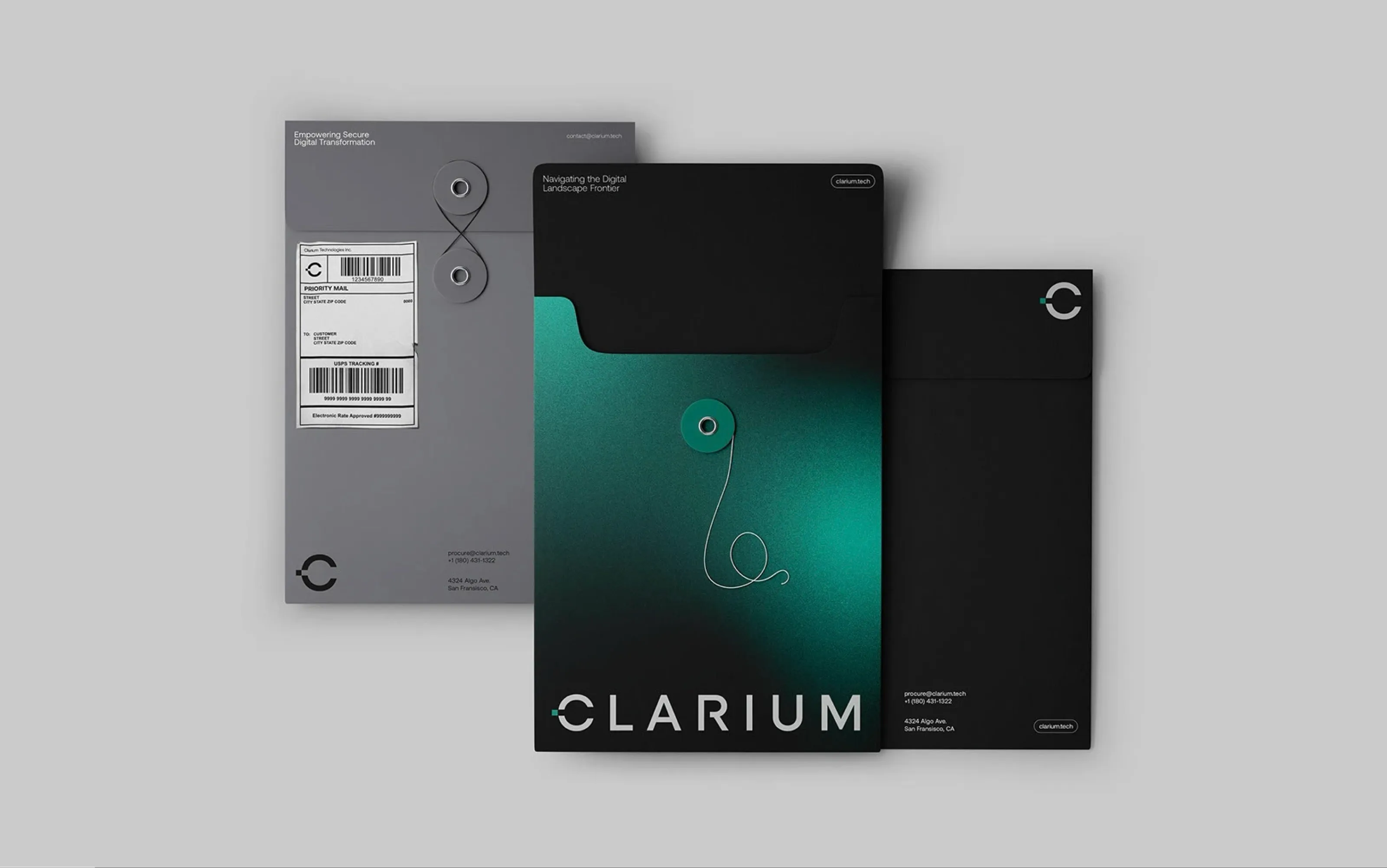
- Applications: website, stationery, document folders, reports, ID badges, apparel and environmental signage.
- Brand guidelines and a pitch deck so the sales team presents consistently.
Outcome
Clarium now presents as the enterprise-grade firm it is. Since the rebrand the company has grown to serve 1,000+ clients with 500+ projects delivered.