
Should your ads go to your homepage or a landing page?
A homepage is built for navigation and a landing page for one decision. Which one your ads need depends on the traffic, and it is cheap to find out.
You have a campaign running and the clicks are arriving at your homepage, because that is where links go. Cost per click is acceptable, cost per lead is not, and somebody has suggested a landing page. Before you commission one, it is worth being clear on what the two pages are each built to do.
A homepage and a landing page have different jobs
A homepage serves everybody: the customer looking for support, the journalist, the job applicant, the buyer who half-remembers your name. Its job is to orient people and route them. Good homepages are navigational by design, with eight menu items, a brand story, a few categories, and no single dominant action, because committing to one would fail most of the people who land there.
A landing page serves one person arriving with one thing in mind, and asks them to make one decision. No menu, no routes out, one promise and one action repeated down the page.
| Homepage | Landing page | |
|---|---|---|
| Audience | Everyone, any intent | One segment, one intent |
| Primary job | Orient and route | Get one decision |
| Navigation | Full menu | None, or logo only |
| Calls to action | Several, competing | One, repeated |
| Content | Breadth: who we are, what we do | Depth: one offer, objections handled |
| Changes | Rarely, by committee | Often, per campaign |
| Best traffic | Branded search, direct, returning | Cold paid social, non-branded search, email campaigns |
Sending cold ad traffic to a homepage is not a mistake of taste. It is asking a page built for breadth to do a job that needs depth.
Message match: the three-second test
This is the part that moves numbers most, and it costs nothing. The headline on the page should repeat the promise in the ad, in close to the same words.
Open your ad. Write down the exact phrase that made the click worth it, something like “same-day boiler service in Manchester, fixed price”. Now open the destination page. If those words, or something unmistakably the same, are not in the first screenful, the visitor has to work out whether they are in the right place, and a meaningful share of them will not bother.
Three mismatches we see constantly:
- The ad names a discount; the page has a generic hero and the offer sits in the footer.
- The ad names one product; the page is a category listing of forty.
- The ad speaks to one city; the page lists every region you cover.
This is the same failure that shows up as plenty of clicks and no sales, and it is worth reading alongside why Meta ads get clicks but no sales, because the fix is usually on the page rather than in the campaign.
Visual continuity counts too, and it is easier to get right than the copy. If the ad shows a particular product shot or a particular colour, use that same image at the top of the page. People recognise the picture before they read the headline, and the recognition is what tells them the click worked.
What a converting landing page needs, in order
Order matters, because people read down the page and decide as they go. Most pages have the right pieces in the wrong sequence.
- Headline that matches the ad. The promise, in their words, not your positioning statement.
- One-line subhead. What it is, who it is for.
- The action, above the fold. A button or a short form, visible without scrolling on a phone.
- One hero visual. The product, or the result. Not an abstract illustration.
- Three to five benefits, written as outcomes. “Fitted the same day” rather than “efficient service”.
- Proof, immediately after the benefits. Reviews, named clients, a figure you can stand behind, a photograph of the work. Proof has to sit next to the claim it supports, not on a separate page.
- The objection the ad created. Price, contract length, delivery time, whatever your sales calls keep repeating. Answer it in plain words.
- How it works, in three steps. This removes the fear of an unclear process more than any guarantee does.
- The action again, with one line of risk reduction next to it: no obligation, cancel any time, 30-day returns, whichever is true.
- A short FAQ. Four to six questions, taken from what people actually ask.
What to leave off: the main navigation, links to your blog, social icons, a second competing offer, and a long “about us”. Every one of those is an exit.
Your form sits inside step three or nine, and its length is a separate decision with its own trade-off. How many form fields is too many works through it, and the short version is that it depends on whether your bottleneck is lead volume or your sales team’s time.
When the homepage genuinely is the right destination
We would not build a landing page in these cases, and saying so saves clients money.
- Branded search. Someone typing your company name wants your actual site. Send them there.
- Remarketing to people who already visited. They are mid-consideration and want to look around. Give them the navigation back.
- A strong, known brand with one product. If the homepage already has one clear action and the brand does the persuading, a landing page adds a maintenance burden and little else.
- Small e-commerce catalogues. Send product ads to the product page, not a facsimile of it. For shops, the collection or product page is the landing page, which is why traffic but no sales on Shopify is a product page diagnosis rather than a landing page one.
- Budgets under our minimum. Below around $1,000 a month in ad spend, a bespoke page per campaign will not gather enough data to justify itself. Fix tracking and the existing pages first.
There is also a plain operational test: will anyone keep the page current? A landing page with last season’s price on it is worse than a homepage that is merely generic.
How to test it without a testing tool
You do not need split-testing software to answer this. You need one duplicated campaign and some discipline.
- Take your best-performing existing ad set or campaign. Duplicate it.
- Change exactly one thing: the destination URL. Same creative, same audience, same bid strategy, same budget.
- Tag both destinations with distinct UTM parameters, so
utm_content=homepageandutm_content=lp-v1. - Split the budget evenly and leave it alone. No mid-flight edits, no pausing the one that looks worse on day two.
- Run until each side has at least 30 to 50 conversions. Below that you are reading noise.
- Compare cost per qualified lead or cost per sale, not click-through rate and not conversion rate alone. A page can convert better and still deliver worse leads.
Two things to watch. Learning phases reset on edits, so resist tinkering. And make sure both destinations are measured the same way: if the landing page fires a conversion event the homepage path does not, you have built a measurement difference and called it a result.
If the two sides finish within about 10% of each other, treat that as a draw and keep the homepage. A tie means the page was not the constraint, and you have just saved yourself an ongoing maintenance job. Look instead at the offer, the audience, or how quickly anyone follows up, since a lead answered in five minutes behaves very differently from one answered the next morning, as speed to lead sets out.
What this looks like when we do it
Most of our landing page and web design work is exactly this: conversion-focused pages built for a specific campaign rather than a general site refresh, matched to the brand but stripped of the routes out. Where the offer needs more than one page, the same logic extends into a funnel. A webinar funnel built on the same principle reached a 38% signup rate, because the page asked for one thing and the ad had already promised that exact thing.
The decision in front of you
If your campaigns send cold traffic to a homepage and your cost per lead is unsatisfactory, you have a cheap experiment available: one page, one duplicated campaign, three weeks. That is a far smaller commitment than a site redesign, and it answers the question with your own numbers rather than someone’s opinion.
If the experiment says the landing page wins, you then have a build decision rather than a guess. Our landing page and CRO work starts with a free audit: a strategist reviews your campaigns and pages beforehand, 30 minutes together, and you keep the one-page action plan whether or not you work with us.
Common questions
Should I send ads to my homepage or a landing page?
Send cold traffic, where the person has never heard of you, to a landing page built around the one offer in the ad. Send branded search and remarketing traffic to the homepage or a product page, because those people already know who you are and want to look around. The split is about intent, not channel.
Why do homepages convert badly for paid ads?
A homepage is built to serve every visitor, so it offers navigation rather than a decision. Someone arriving from a specific ad has to find the thing the ad promised, and most leave instead. The homepage is not broken; it is doing a different job well.
What makes a landing page convert?
Message match with the ad, one action repeated rather than several competing ones, proof close to the call to action, the objections handled in order, and a form asking only what you genuinely need. Removing the main navigation usually helps, because it removes the exits.
How do I test a landing page against my homepage?
Duplicate your best-performing campaign, change only the destination URL, split the budget evenly and tag both with UTM parameters. Run until each side has at least 30 to 50 conversions, then compare cost per qualified lead or sale. No testing tool required.
Do I need a landing page for every ad?
No, and trying usually makes things worse. One page per offer, not per ad. Several ads can share a page as long as they make the same promise. Build one page properly and reuse it before you build five you will never update.
Proof from our work
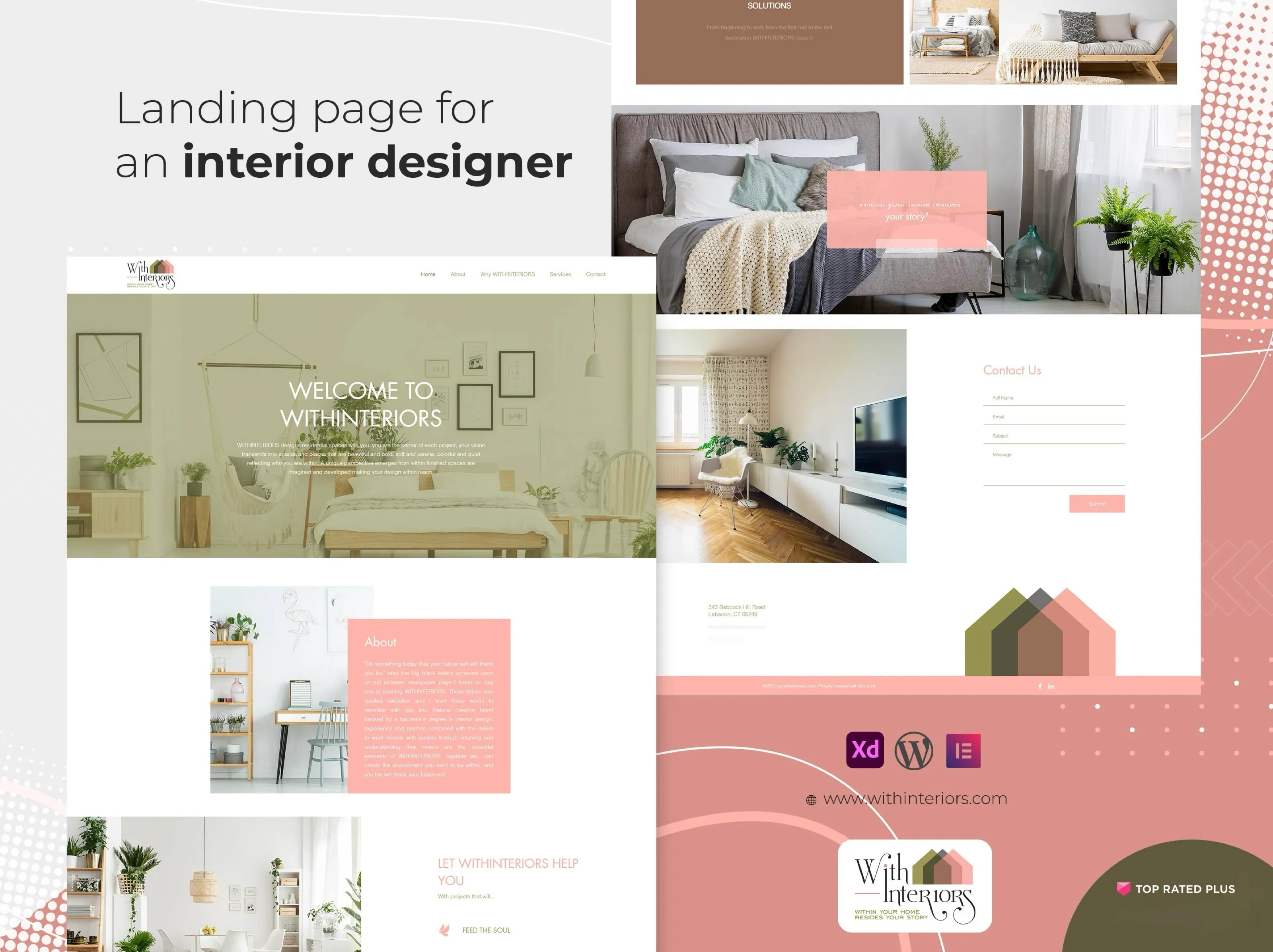
Landing pages, website pages and banners for clients
- Conversion-focused landing pages for campaigns
- Page and banner design that fits the existing brand
- Bug fixes and customisation on live sites
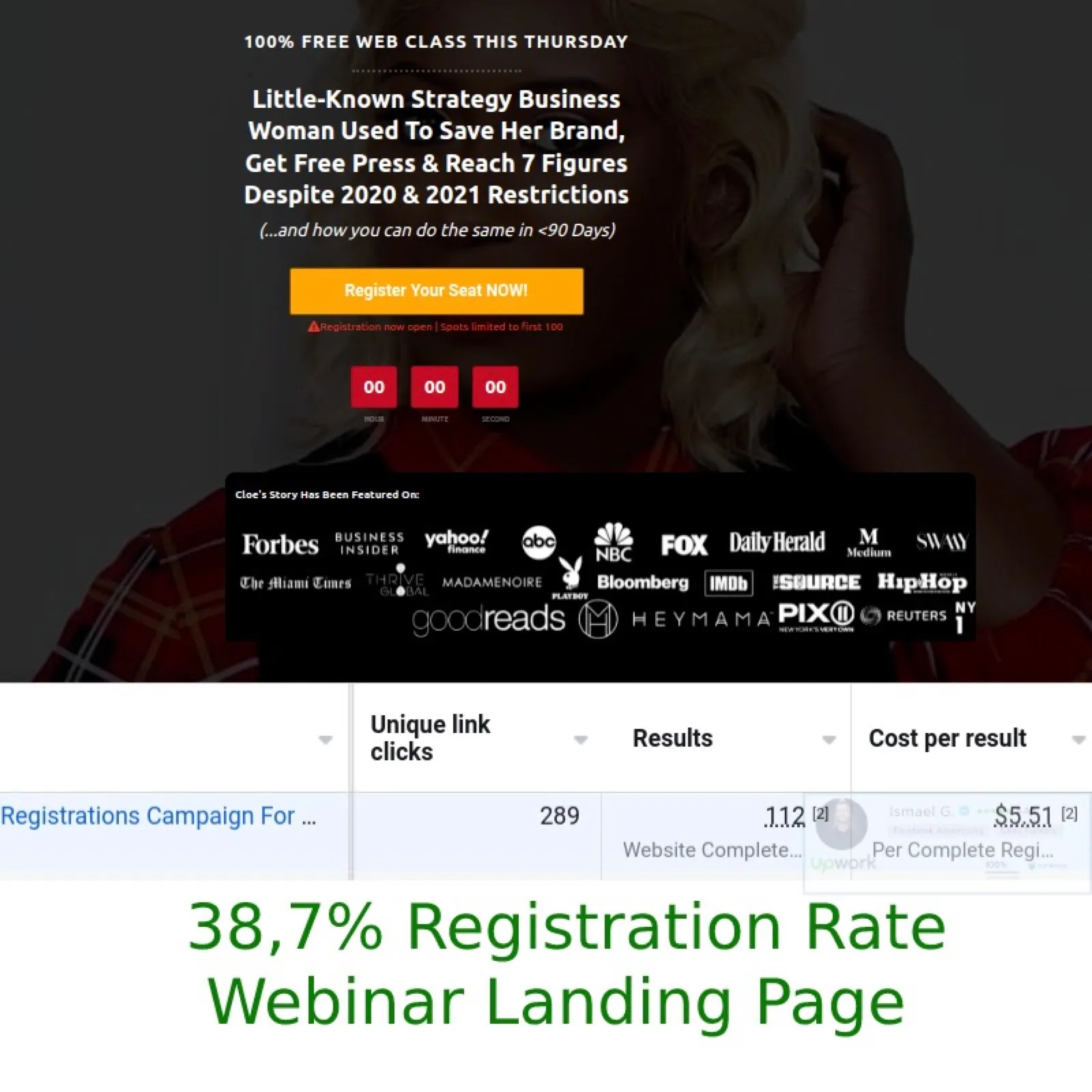
Registration rate from cold traffic
A coach needed a webinar funnel and had never run one. We built the pages, wrote the headline and copy, and launched the ads. The landing page converted 38% of cold traffic into registrations.
Read case study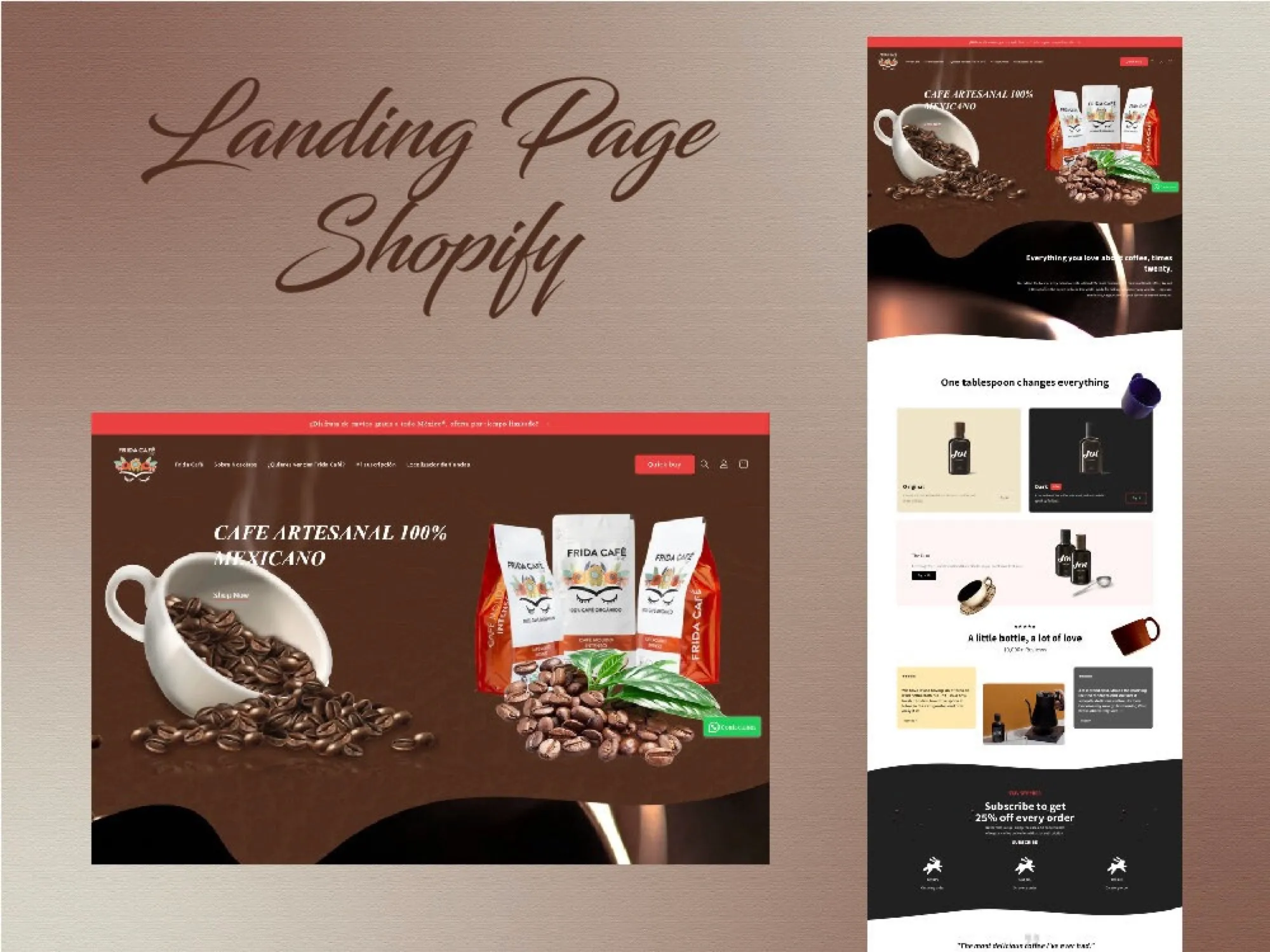
Design to delivered page
A single, fully mobile-responsive landing page for Frida, a coffee products company, designed and delivered within one day.
Read case study